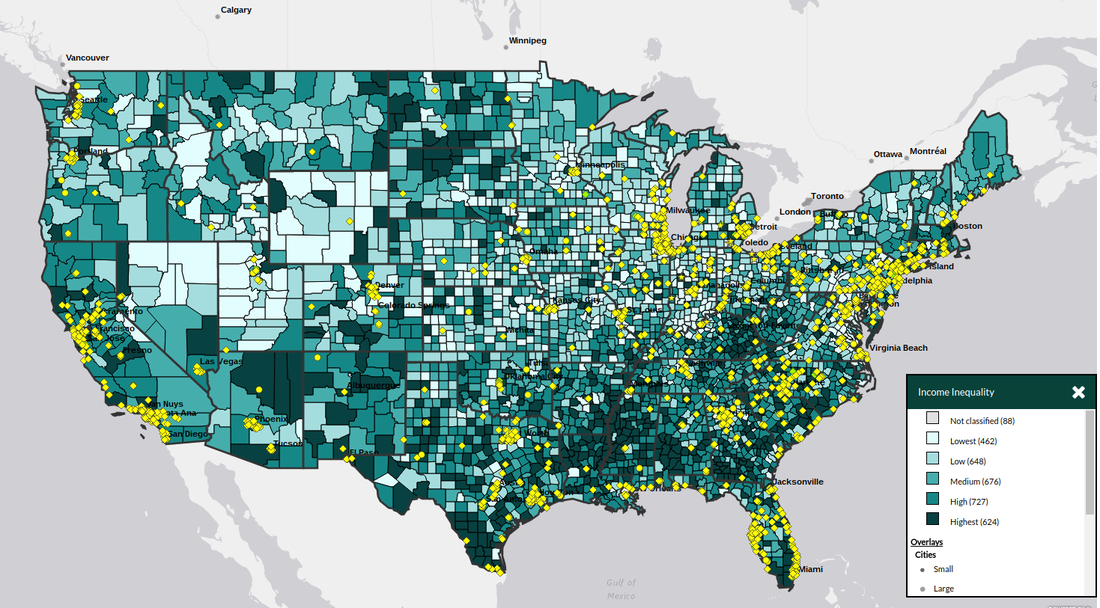
E.W.Y- this is a graph that basically tells you about income equality, meaning that the darker places have more of a gap between rich and poor and the lighter places have less of a gap between rich and poor for EX: dark place rich make 100 $ a week poor make 30$ a week in a lighter place rich make 100$ a week poor make 80$ a week.
People, H. (2017). HP2020 Objective Search. Retrieved April 25, 2017, from https://www.healthypeople.gov/2020/data-search/
People, H. (2017). HP2020 Objective Search. Retrieved April 25, 2017, from https://www.healthypeople.gov/2020/data-search/
Delcy L. G.
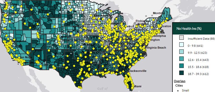
This graph shows how states with darker colors have no access to health care, that is more then the whole state meaning that people do not know if they have a disease because they have no person that tells them. It is less then 50% of the states that have people who majority has health care access meaning they will save them self's from a heart attack. As we can see that Texas which is the biggest state more than half of the population does not have access to health care, meaning that a plan needs to be made so people do not die of heart disease which is the number one death problem.
People, H. (2017). HP2020 Objective Search. Retrieved April 25, 2017, from https://www.healthypeople.gov/2020/data-search/
Talal A.
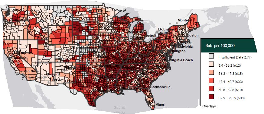
This graph shows the deaths of woman in areas round the world in lower income areas(which are the darker shaded areas in the map) where they cant afford to buy healthy food from the store to cook at home.
This graph shows the deaths of woman in areas round the world in lower income areas(which are the darker shaded areas in the map) where they cant afford to buy healthy food from the store to cook at home.